Banner studio
Delivery Hero (foodpanda, foodora, yemeksepeti), 2024–2026
Marketing banners are one of the highest-frequency things a user sees in the app — foodora alone produced up to 1,500 a month (exact, per the Jan 2025 audit deck) — but three brand teams made them independently, in different tools, with no shared system or governance. I built the design system that fixed that, then partnered with an engineer to turn it into Banner Studio, a self-serve tool that let local marketers create on-brand banners without waiting on regional design. What started as a banner project became the template for how the company approaches consistency everywhere else a user sees a message.
Role
Lead designer
Design systems | 0-to-1 product design | Cross-functional leadership | Design ops & enablement | User research
Metrics
% of live banners created via Banner Studio
Reduction in manual banner requests to the creative team
Brand-guideline compliance (via audit)
Markets onboarded
Platforms
Figma (design system)
Web app (Banner Studio)
Braze (in-app messaging, phase 2)
Collaboration
Brand teams
Product managers
Engineering
CRM team
Commercial team
Result
16 markets
onboarded to Banner Studio
~70%
of live banners now created through Banner Studio rather than manually requested from a design team
Banners are inconsistent, low quality and time consuming to create.
Each brands are working in silos in the past
foodpanda, foodora and yemeksepeti each made their own marketing banners independently, in whatever tool their local team used — Photoshop, Canva, Illustrator — with no shared system or governance. Quality varied wildly and nobody could say how many banners were even going out each month.
Rather than start redesigning, I audited more than 500 live banners across all three brands and every market. The visual issues — cluttered text, off-brand colors, poor contrast — were symptoms. The root cause was structural: anyone across commercial, local marketing or external vendors could publish a banner with no systematic review, and there was no reusable template to make the "right" version the easy default.
The approach
Checkout
Highest visibility, catches people right when they're deciding how to pay
Payment selection page
Relevant, but only reaches people who already opened that screen
Account
Matched what users told us they expected, but lower reach on its own
We shipped all three as complementary touchpoints rather than picking one, each triggered once per user after they became eligible, so people would run into Postpaid wherever they were already looking for a way to pay.
Building the system before building the tool

The hardest part of Postpaid wasn't the screens, it was that we were asking people to rely on a system that makes a commitment on their behalf without them fully understanding how it works. In research, we kept seeing the same pattern: when we didn't give users enough information, they filled the gap with assumptions from other credit products they'd used before, and those assumptions weren't always right. Users told us they were worried about hidden fees and about losing control of their spending. And in one moderated session, all eight out of eight participants expected to find Postpaid under their Account page, not buried inside checkout.

Users utilise similar service to understand our offering, leading to incorrect assumptions
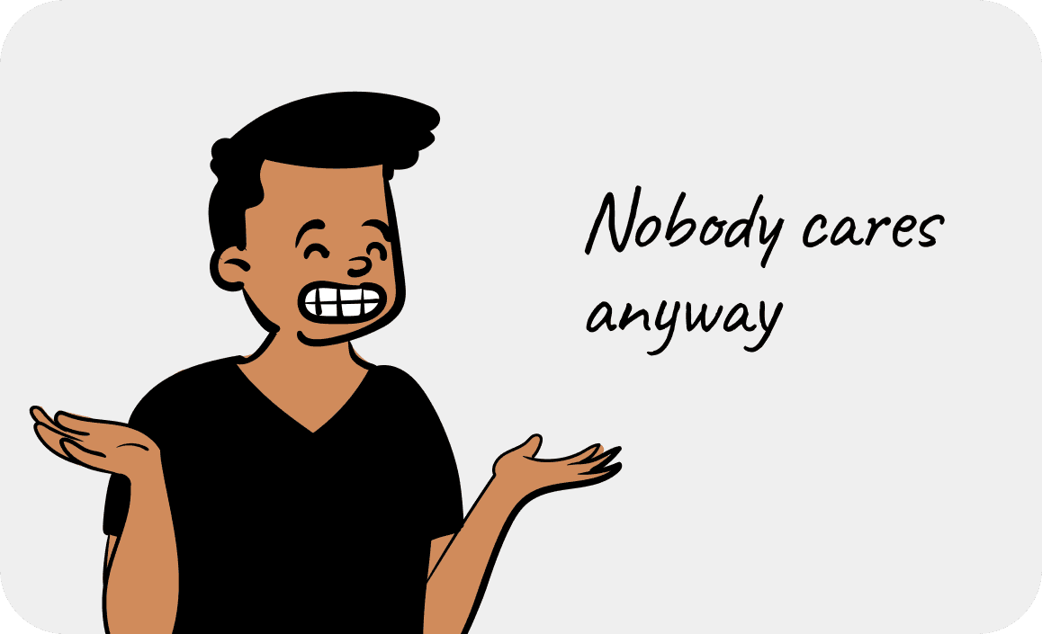
Users are fearful of uncontrolled spending and hidden penalty/fees
Design principles
Build trust through transparency
In fees communications (if any),policy, credit limit and usage across activation, ordering and repayment.
Seamless and supportive
In ordering and repayment journey where payments are involved, it's crucial to ensure the payment is smooth, seamless and users are not left clueless in the case of payment failure.
Beyond banners, the same problem was showing up everywhere else
Once banners were standardized, the same root cause — inconsistent, ungoverned communication design — showed up everywhere else a user saw a message: in-app modals, email, push.
I led phase 2 discovery for the in-app modal (Braze) revamp, standardising foodpanda, foodora and yemeksepeti onto the same shared component system banners used, fixing inconsistent close-button placement, character-limit overflow and off-brand visuals. That shipped as an updated set of in-app modals. From there I scoped phase 3: the same logic applied to email, where only one of the three brands was even on a modern template system.

<Add UI>
Design versions tested in usability testing

Card enablement

Chips with collapsable education

Switch with education info

Policy enforcement
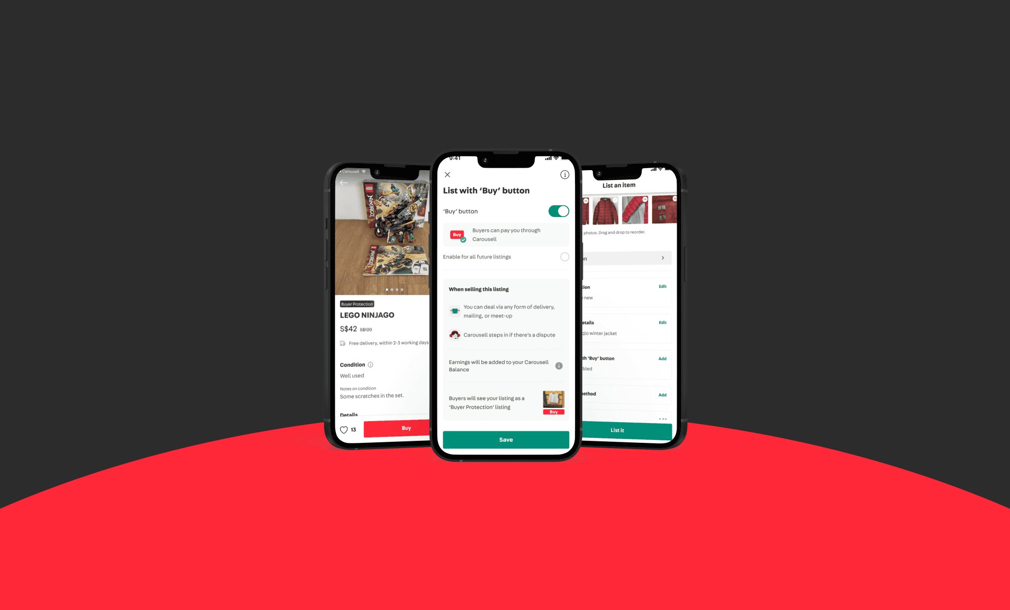
With the update of policy, we are now actively monitoring seller performance as a whole including order cancellation rate, ship out time, dispute rate and reviews. To ensure only sellers with good tracking record can enable 'Buy' button service as the first step of building a good buyer experience.
Sellers who constantly cancelled order will be restricted from listing with Buy button, and only allowed to deal via meet-up as meet-up is still a safer deal method for both buyers and sellers to minimize transaction risk.

Education
For sellers who are creating their very first listing with escrow, I've included education touch points only after their listing is created successfully to avoid disrupting user's goal to create listing
Post-listing education
Post-listing
For sellers who created their very first listing with escrow, I’ve worked with engineers to create an education component at the end of the listing journey.
Chatbot
To be resourceful, I made use of an existing chatbot capability as education tool to create an interactive Q&A bot. I worked with UX writer and a Backend engineer to craft the chatbot flow and content design as part of the onboarding education.

Post-listing education
Learnings
The hardest part was never the visual design, it was bringing people together.
Changing a shared design system and workflow wasn't a decision I could make inside product design alone; it meant aligning expectations, direction and execution with brand, marketing and commercial teams across all 16 markets, each with their own priorities and their own way of working already in place. That high dependency is what made adoption the real project, not the templates.
Partnering with an engineer early, and being deliberate about how the Figma file itself was structured, mattered as much as any template, because the tool was only as good as the source of truth feeding it. Once one surface was fixed, the same root-cause thinking kept finding the next one — banners, then in-app modals, then email — which is probably the real shape of this project: not "redesign a banner," but build a repeatable way to stay consistent without slowing any brand down.
What I'd do differently today?
AI can now generate and adapt on-brand assets fast enough that the constraint isn't tooling up production anymore — it's keeping every surface cohesive as output multiplies. I'd love it push it at the campaign level instead: one AI-assisted system that takes a campaign's core message and adapts it across banners, in-app modals, email and whatever collateral comes next, checking brand cohesiveness automatically instead of by manual audit. Banner Studio would have been one output of that system, not the whole project.